Genetic Population Structure Visualization

– 6 min read


The promise seems irresistible: gather ancient and modern DNA, arrange people as points on a chart, and watch the past appear. It looks neat, almost architectural. But the deeper story is far more dramatic. The human past can be badly misread when only a few corners are excavated. This study shows that when DNA sampling is patchy and certain genetic variations are removed, familiar ancestry maps become warped, flattened, and treacherous.
The heart of the matter is what might be called a genetic landscape. Nearby communities exchange marriage partners more often than distant ones, creating soft patterns rather than sharp borders. In genetics, however, such landscapes are often squeezed into a simple two-axis picture. That is where the trouble begins.
Researchers created simulated worlds of 331 local populations arranged across a triangular grid. Under ideal conditions with dense sampling, the ancestry plot recovered the simulated world's shape extraordinarily well. But when sampling became sparse and rare genetic variants were removed, elegant landscapes began to collapse. Hexagons turned into triangles. Marginal groups became bizarre outliers. Other groups drifted inward, easily mistaken for especially mixed populations.
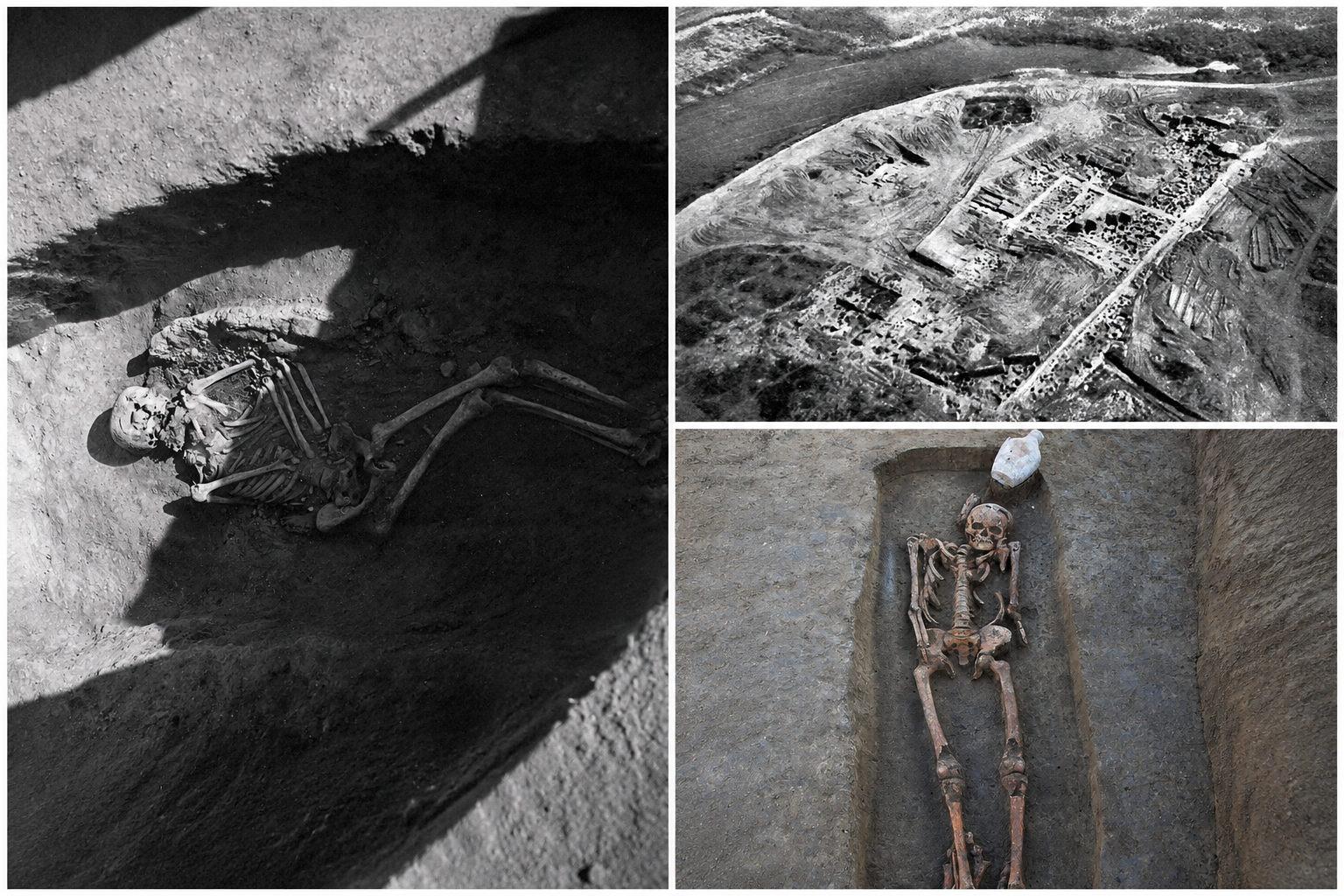
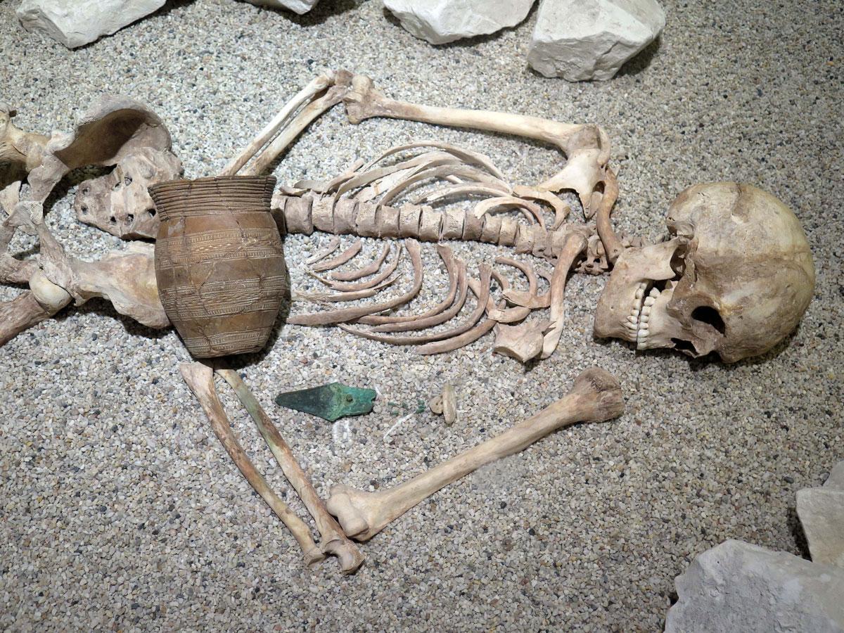
The danger is obvious for archaeology. A burial group from an edge zone might appear unexpectedly close to a major population cluster not because it truly belonged there, but because local genetic clues marking its distinct position had vanished in filtering. A spurious visual closeness might become a migration story, an admixture story, even an identity story.
The lesson is not that genetic visualization is useless. Under good conditions it can be astonishingly powerful. But these plots must be treated like excavation plans rather than final verdicts. One should ask what is missing, what has been filtered out, and whether a dramatic pattern might be a trick of preservation. The past is certainly there. But it will not always sit obediently inside a triangle.
Instead of beginning with a famous cemetery, this work begins by constructing worlds: carefully laid out landscapes populated with communities behaving over time. The simulated setting placed 331 small populations across a triangular grid, exchanging people with neighbors over approximately 2,500 generations. Some simulated worlds had smooth movement, others had barriers, and others featured bursts of long-distance contact, the genetic equivalent of sudden historical intrusions or elite expansions.
Two time slices were sampled, with three individuals taken from each local population at each moment. Then researchers deliberately injured the evidence, reducing samples to 200 individuals and then to 50, while removing rare genetic variants at several thresholds. These rare variants are often the fine threads stitching neighboring people together. Cut enough threads, and the tapestry loosens.
The simulations revealed how easily grand narratives arise from damaged evidence. A densely sampled world looked clear and coherent. Once thinned and filtered, landscapes folded into triangles, local neighborhoods dissolved, and marginal communities were pulled unnaturally toward central positions. Crucially, these distortions closely mirror real research conditions, where ancient DNA is nearly always patchy and certain data types are preferred for convenience.
The simulations are not defeatist. They insist one must know the limits of the trench. An excavator finding a row of graves does not assume it is the whole cemetery. In the same way, a dramatic geometric pattern in sparse data is not automatically history itself. When evidence is broad and local detail preserved, the landscape can still be seen. When evidence is patchy and fine detail discarded, the past masquerades as geometry.
If old pictures can mislead, what comes next? Rather than trusting the first two or three axes of a genetic chart, researchers explored vast numbers of alternative arrangements, judging them by how well they preserve meaningful relationships rather than how elegant they appear.
Three methods proved central: UMAP, densMAP, and PHATE. Each captures structure in high-dimensional data while laying it out in two or three dimensions. PHATE repeatedly emerged as especially effective, preserving both local and global shape. Strikingly, the best results often came from using far more input dimensions than expected, sometimes nearly the full rank of the data, suggesting that important structure lurks deeper than the first few components, like activity areas on an archaeological site hidden beyond the monumental center.
The framework explored millions of candidate embeddings across simulations and large real datasets. Different goals yielded different maps, and no single algorithm proved universally best. But the approach made interpretation grounds explicit and testable rather than relying on visual habit or default settings.
For archaeologists and historians, the significance is immediate. If an ancient burial population sits ambiguously between two larger clusters in a standard plot, an optimized approach may reveal whether that reflects genuine mixture, sparse sampling, or data compression artifacts. Old plots become one candidate among many, to be challenged and checked against independent evidence rather than accepted as self-explaining portraits of history.
Once proven in simulated worlds, the framework was tested on real populations, turning abstract geometry into recognizable peoples and landscapes.
Among the Orang Asli, Indigenous groups of the Malay Peninsula, ordinary plots showed three rays with the southernmost Seletar group pulled into a long separate arm. Optimized PHATE unfolded these lines into a broader gradient, revealing internal variation within groups and clearer separation among geographic neighbors. Individual outliers began making sense, with some people appearing closer to neighboring clusters, likely reflecting recent migration or mixed ancestry. These placements agreed independently with networks of shared long DNA segments.
For red deer across Europe, North Africa, Anatolia, and the Caucasus, standard plots were dominated by dramatic outliers from Italy, Iberia, and the Caucasus, overwhelming subtler continental structure. Optimized embeddings kept those strong outliers visible while revealing finer connections across real landscapes, exactly what zooarchaeology needs.
In Papua New Guinea, standard plots encouraged highland and lowland patterns to be treated separately. The optimized embedding united them, tracing lowland populations in a geography-shaped semicircle around the mountain spine while revealing extra structure among neighboring highland provinces. Geography kept reappearing not as a deterministic prison but as a persistent framework within which histories of contact and isolation unfold.
Across all three cases, better visualization returned historical dignity to the data, allowing gradients to appear where clouds once sat, local neighborhoods to reappear where triangles had flattened them, and intriguing individuals to emerge from within broad population labels.
The most historically arresting case involves ancient Eurasia, with over 5,000 individuals spanning the Iron Age to the Late Middle Ages across a vast territory from Iberia to the Volga. Standard three-dimensional plots struggled to reveal the structure historians care about most.
A separate line of evidence, shared long stretches of DNA indicating connected populations, had already identified meaningful communities. One striking community gathered nearly all medieval individuals from Slavic cultural settings into a Central-East Europe group. Another, from Germanic burial contexts, formed a Northwest Europe group. On ordinary plots, their separation was weak, drowned in broader Eurasian variation. Material culture, burial custom, and historical linguistics all suggested difference that the standard ancestry plot could not clearly resolve.
A layered search examined hundreds of thousands of candidate embeddings, ultimately selecting a PHATE embedding built from 44 input dimensions. This preserved major Asian clines linked to steppe movements while resolving Europe into two distinct clines: one through West Europe and the West Mediterranean, another through East Europe and the East Mediterranean. Within this structure, the Slavic-associated community emerged far more clearly.
The most exciting individuals were the earliest community members, dated roughly 150 to 550 CE, appearing from the Middle Danube to the Don and toward the Middle Volga. Each was locally unusual relative to surrounding populations, yet in optimized space they clustered tightly together. This suggests the ancestry profile later associated with Slavic-speaking populations was already dispersed across multiple regions during the Roman and Migration periods, before fuller medieval expansion becomes visible in archaeology and texts.
Independent support came from Y-chromosome lineages, formal ancestry modelling, and out-of-sample distance tests. Present-day Eurasian data strengthened the picture further: populations speaking Germanic, Romance, and Celtic languages mapped along one cline, while Slavic and Baltic speakers mapped along the other, a historically resonant distinction that standard plots had largely compressed away.
The embedding is not the answer. It is the spark. The graves remain where they were dug, the objects remain in their contexts, the named peoples remain debated. But the hidden structure connecting them has become a little easier to see, turning a visual pattern into a serious historical question about how a major linguistic and cultural zone emerged across Eurasia.
https://www.biorxiv.org/content/10.64898/2026.08.11.744230v2.full.pdf

Comments